Named it, then built everything the name implied: a house rather than a shop. Monogram, colour and type system, verbal identity, papers, a social system and the site.
For a business that can show neither its founder nor its stock: an identity that earns trust through process and documentation instead of a face.
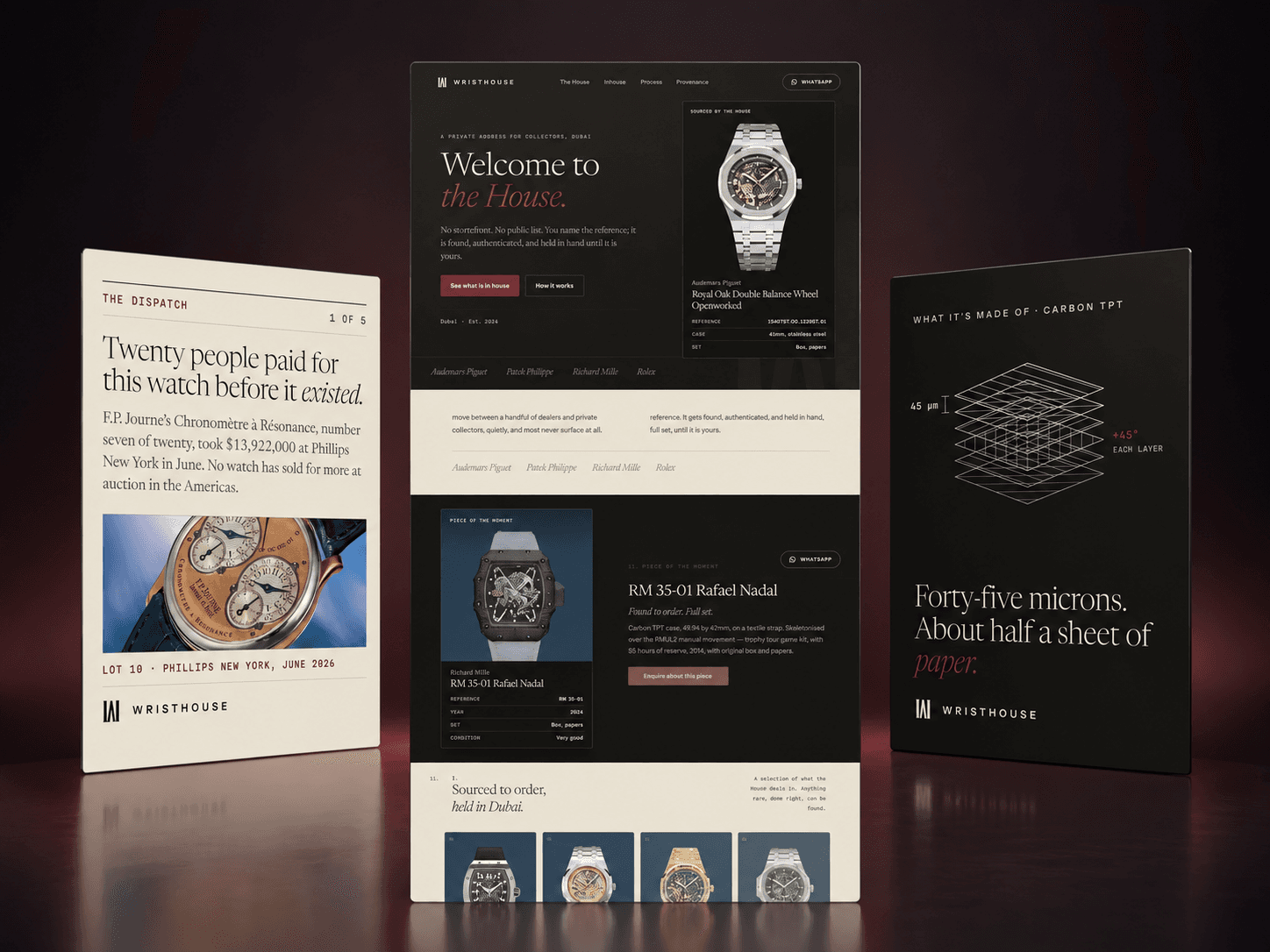
The brief
A private watch office, sourcing the top tier for a small number of collectors. No storefront, no public list, no prices. It had to be faceless, and it had to look as expensive as the pieces.
What we did
The name set the direction: a house keeps, knows and introduces. We drew a W and H as one compact monogram, then built a restrained system around it. Ink and stone do the daily work; oxblood is reserved for moments that need ceremony. The same logic runs through the papers, the website and the social system.
The mark

W and H, one glyph.
The two posts of an H hold the rising strokes of a W, reducing both initials to one ownable shape. It is drawn on a fixed construction grid rather than typed, so the mark keeps its character from a document stamp to a screen.
The colour
- Ink#14120F · Primary
- Stone#E8E1D1 · Ground
- Oxblood#5E1A1E · Ceremony
- Midnight#22374A · Reserve
The voice
- A house, not a shop.
- We don't sell watches. We let you in.
- In hand. Full set.
The wordmark
Set wide enough to feel like an address.
The wordmark gives the name distance and composure. It carries the identity when the monogram alone would say too little.
Social
Stories, built to swipe.
Two recurring formats, shown as compact working sequences rather than isolated campaign images.
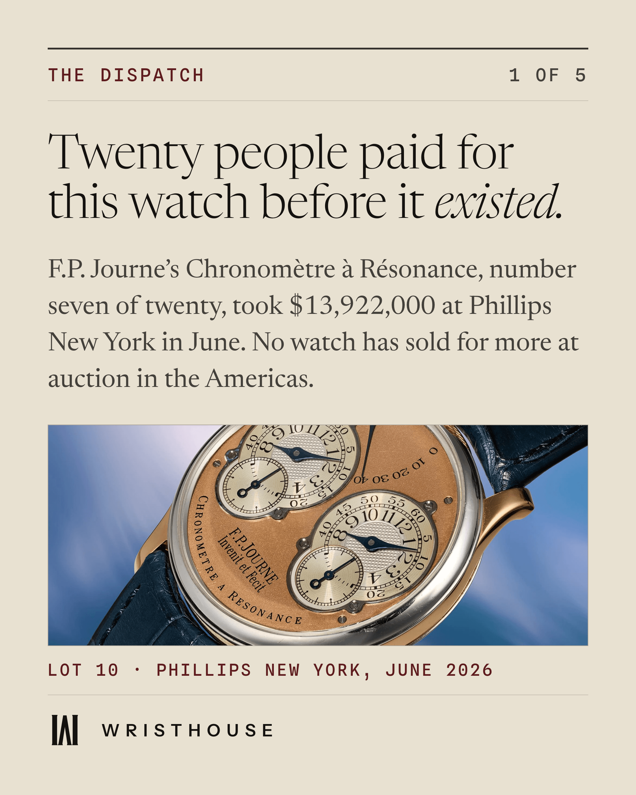
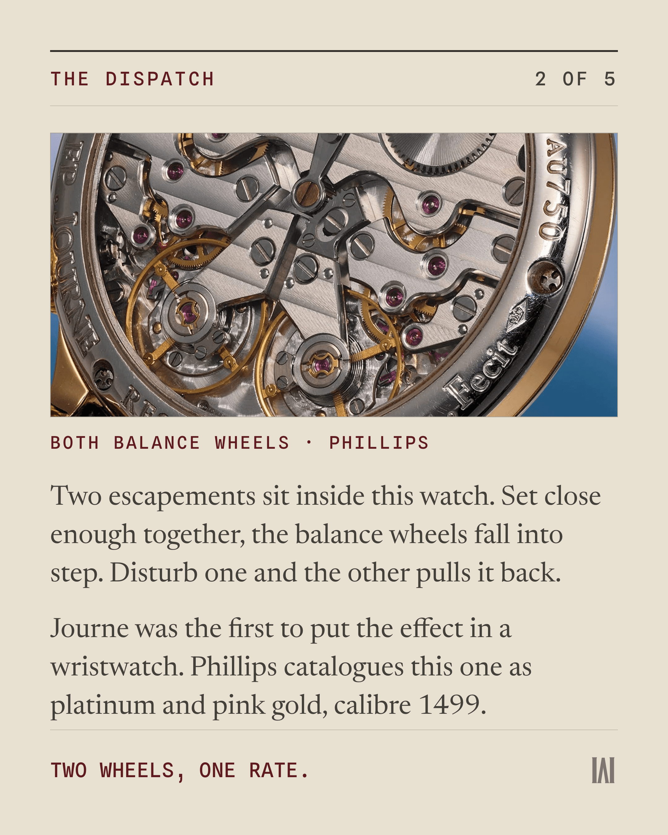
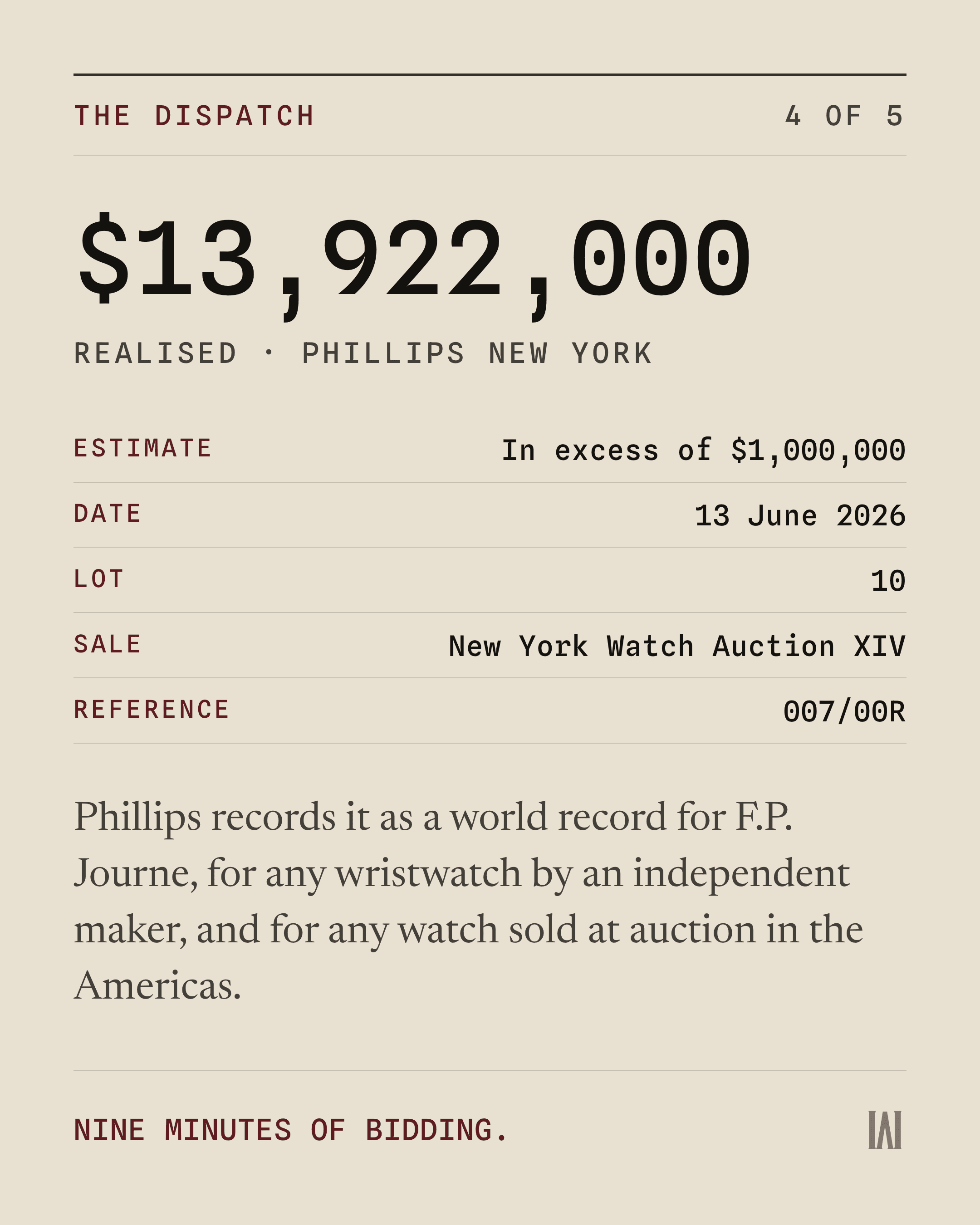
The Dispatch
A record sale, told through the watch and the final number.
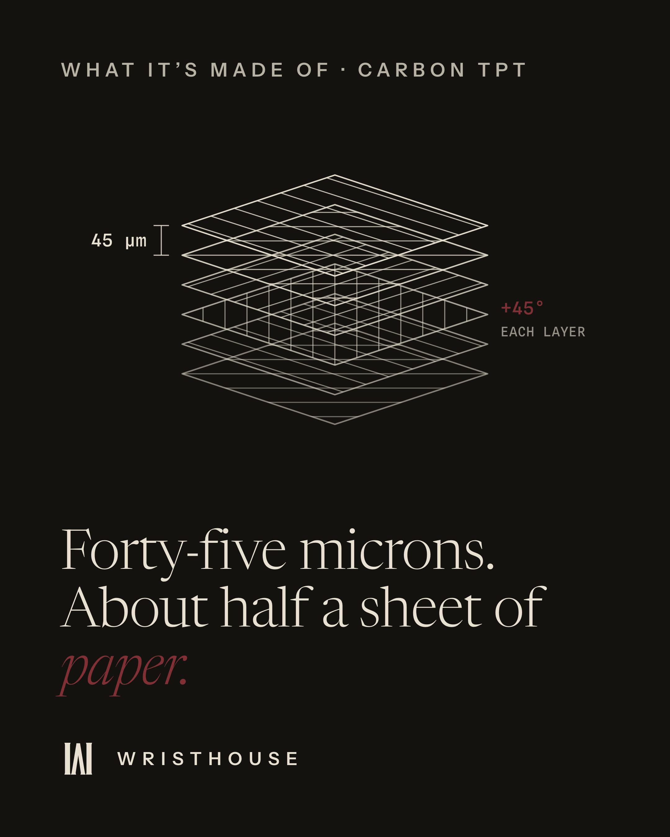
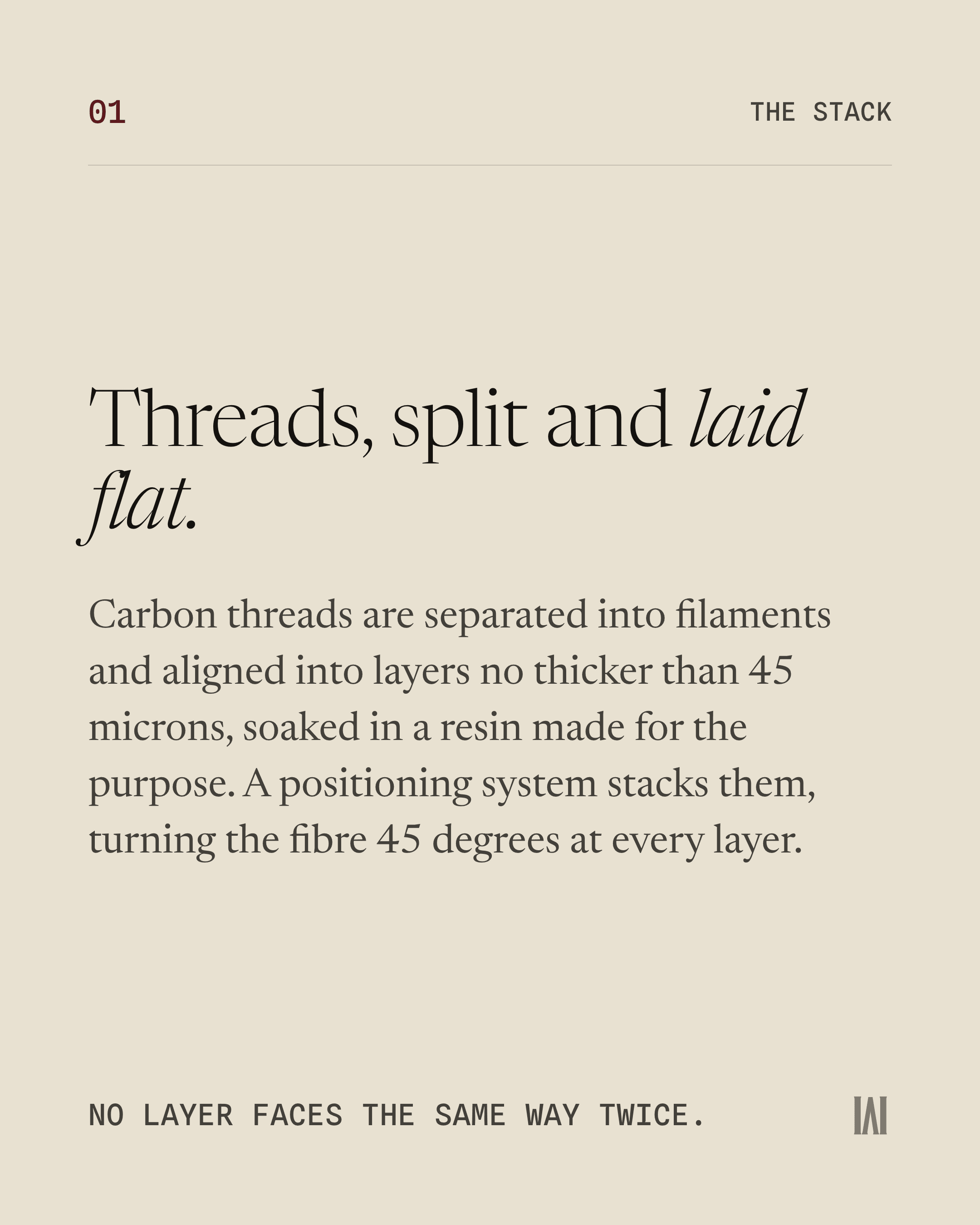
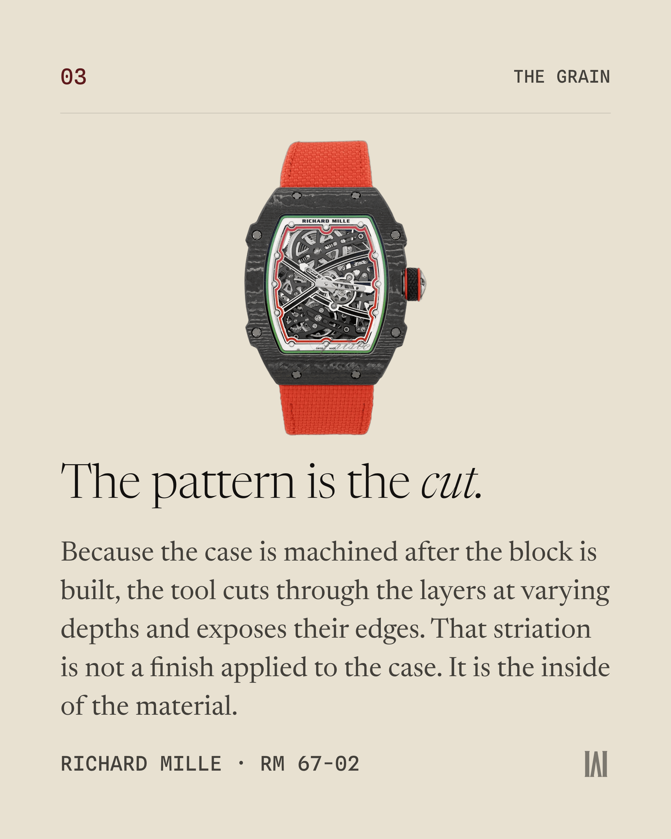
What it’s made of
Material science translated into a story worth saving.
Website

01Scroll inside the frame to explore the full site.