A rebrand for a name that already meant something. Monogram, wordmark, colours and type rebuilt from the ground up, then the website to carry them.
For a business whose name is established but whose look is not: keep the equity in the name, upgrade everything around it.
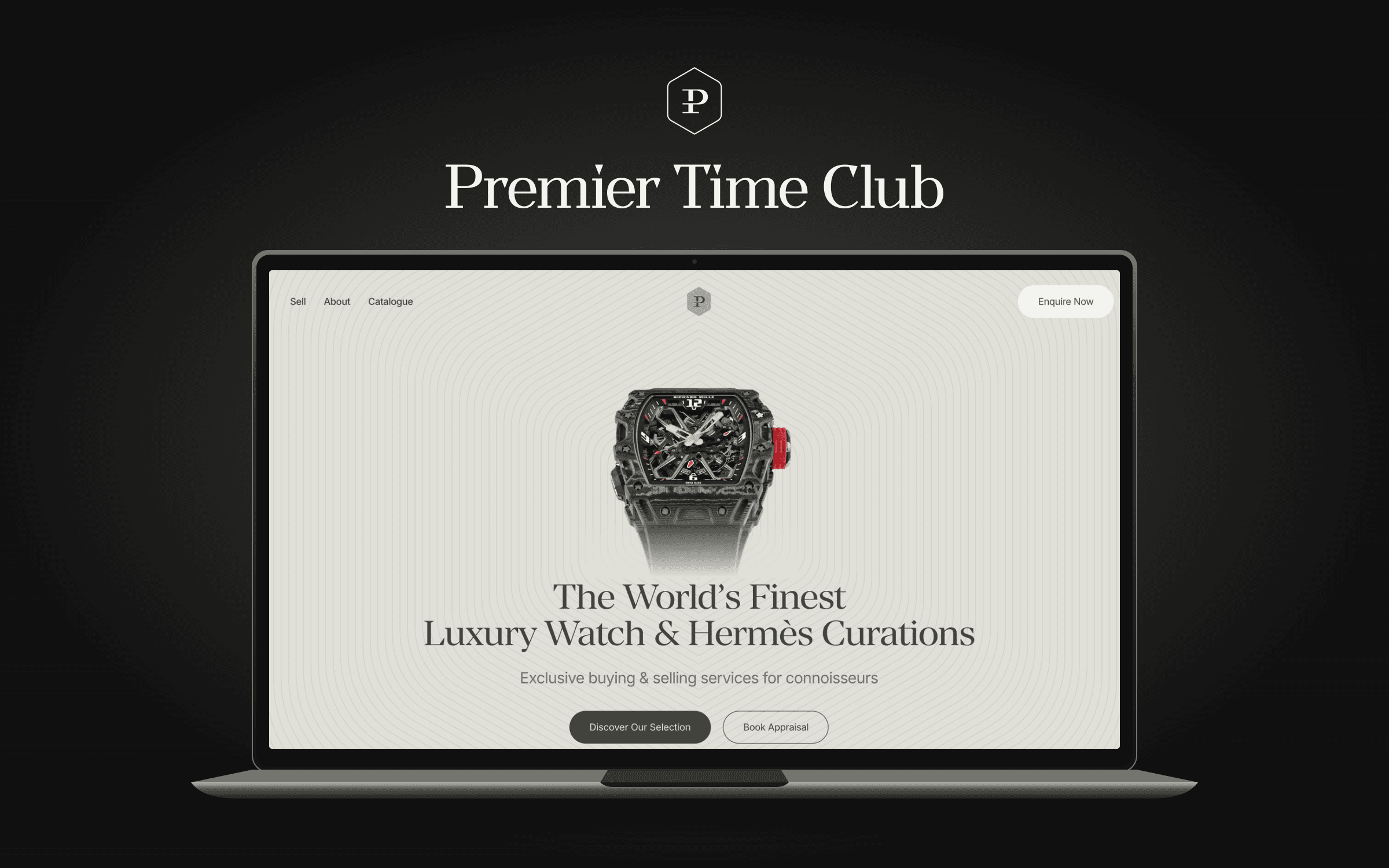
The brief
A UK watch dealer trading at a serious level under an identity that did not match the stock. The name stayed because it was already known, while everything visual had to be rebuilt around it.
What we did
A full identity system: the ligatured P monogram, set in a hexagon device that contains it wherever it lands; a serif wordmark with the weight of the pieces themselves; an olive and stone palette that feels considered without becoming showy; and the type system to run it. Then the website, built on the new identity end to end.
The mark

Premier and Time, one letter.
The P carries a second crossbar, with two initials sharing one stem, and lives inside the hexagon that contains it everywhere it lands, from the favicon to the blind emboss on the box lid. The wordmark sets the full name in Manier, a serif with the weight of the pieces themselves.
The colour
- Cream Ash#DFDFD7 · Primary
- Khaki#A8AA9C · Primary
- Soft Ivory#F2F3EE · Secondary
- Dark Khaki#43443F · Secondary
- Off White#F8F8F8 · Secondary
- Charcoal Black#111111 · Secondary
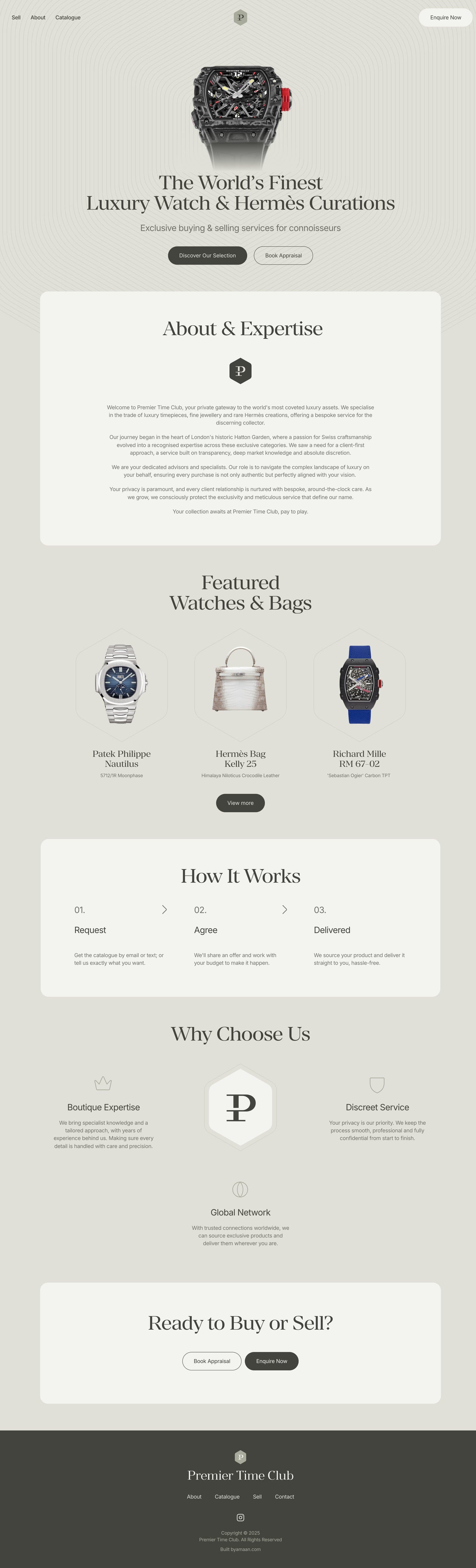
01The site, browsing itself as you scroll.